Research review
Before anything else, I reviewed existing data from past research and interviews with PostUp users so I could gain a clearer understanding of the problem space we were working within.
"If a place has WiFi, outlets, and bathrooms, that's all I need. If I need to buy some food or coffee to stay there, I really don't mind. Bonus points if their coffee and food are actually good!"
"I like to know how crowded a place is; if I'm doing independent work, I don't want it to be super loud. If I'm meeting clients or coworkers there, I want to be sure we get a place to sit and talk for a bit."
"I usually look at pictures of the place before I go, just to make sure there's enough room for me and my coworker to take a table without feeling guilty."
After reviewing all of the existing data, I pulled common themes and shared sentiments that would inform my next steps:
- Not knowing a location's hours of operation & most busy times is a major pain point.
- Noise levels are a concern for many remote workers, especially those who frequently take meetings
- Accommodations like outlets, reliable WiFi, and bathrooms are important to users.
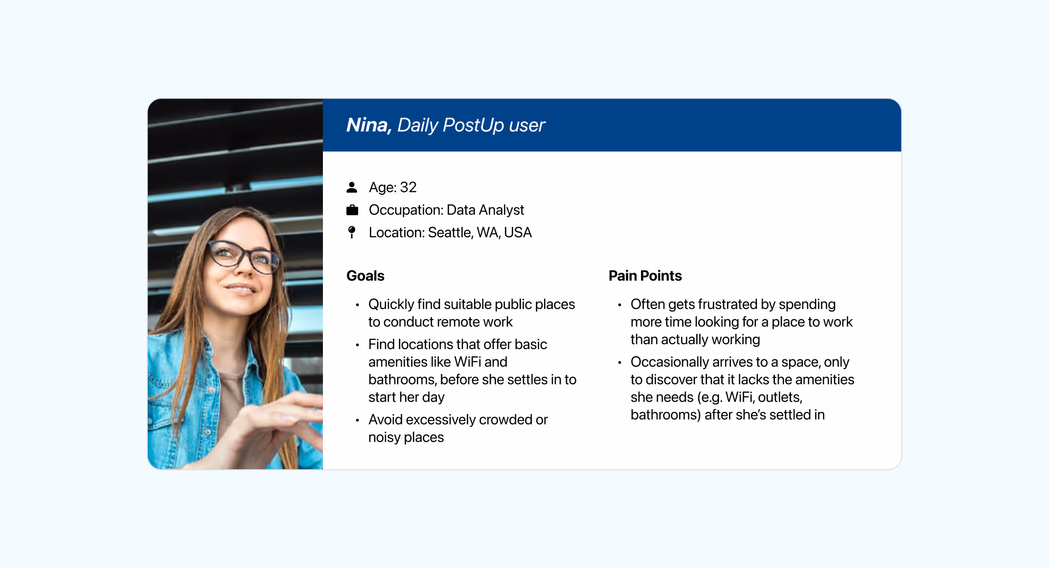
Persona
Based on the information I had, I created one primary persona to represent PostUp's average end user and guide my design process as I moved forward.
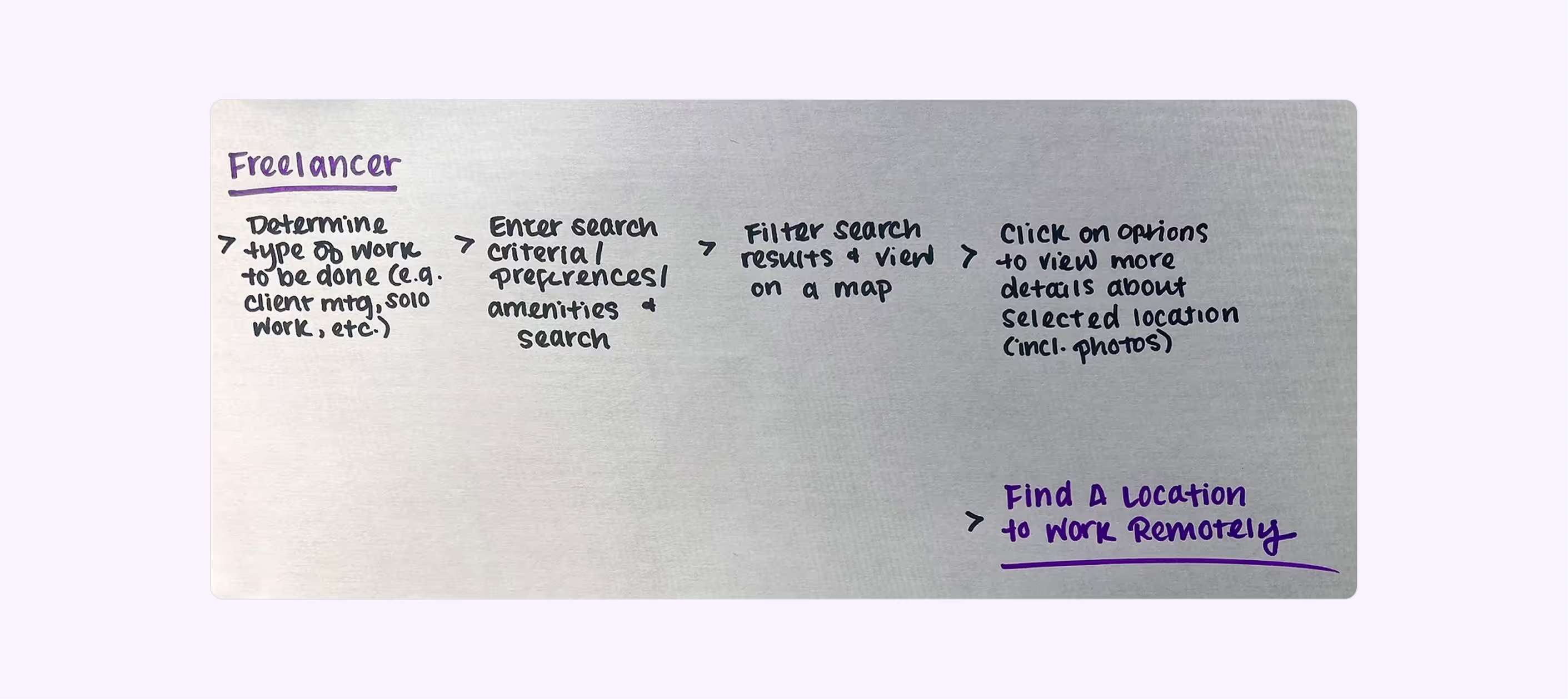
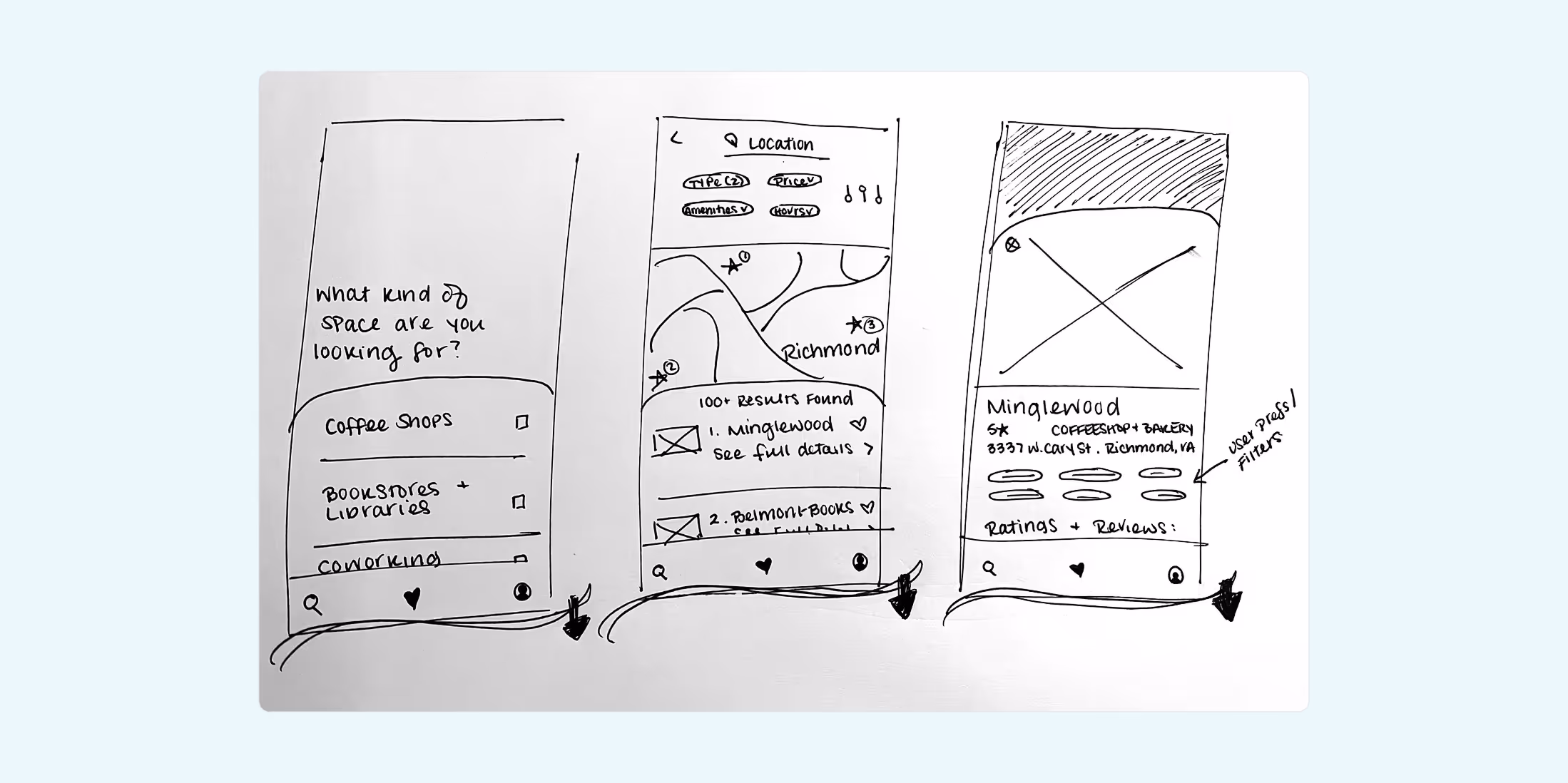
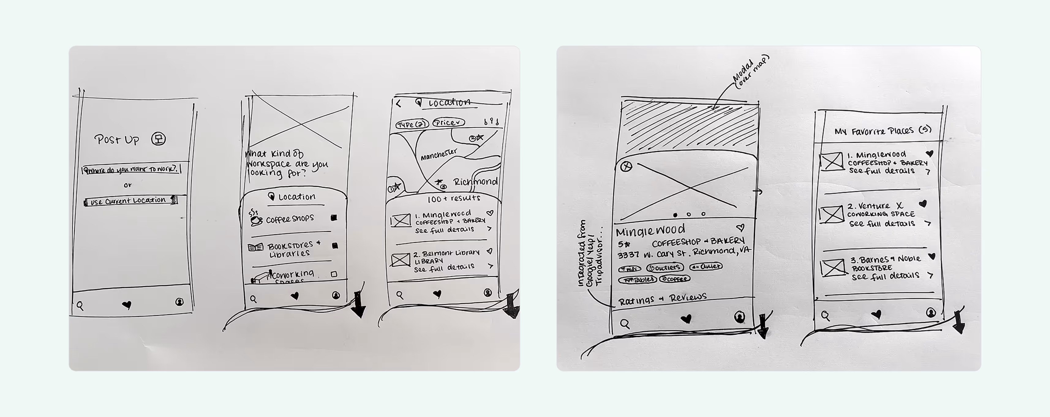
Story mapping
With a clearer understanding of who these users are and the challenges they face, I could really jump in and imagine how the end-to-end solution flow might look.
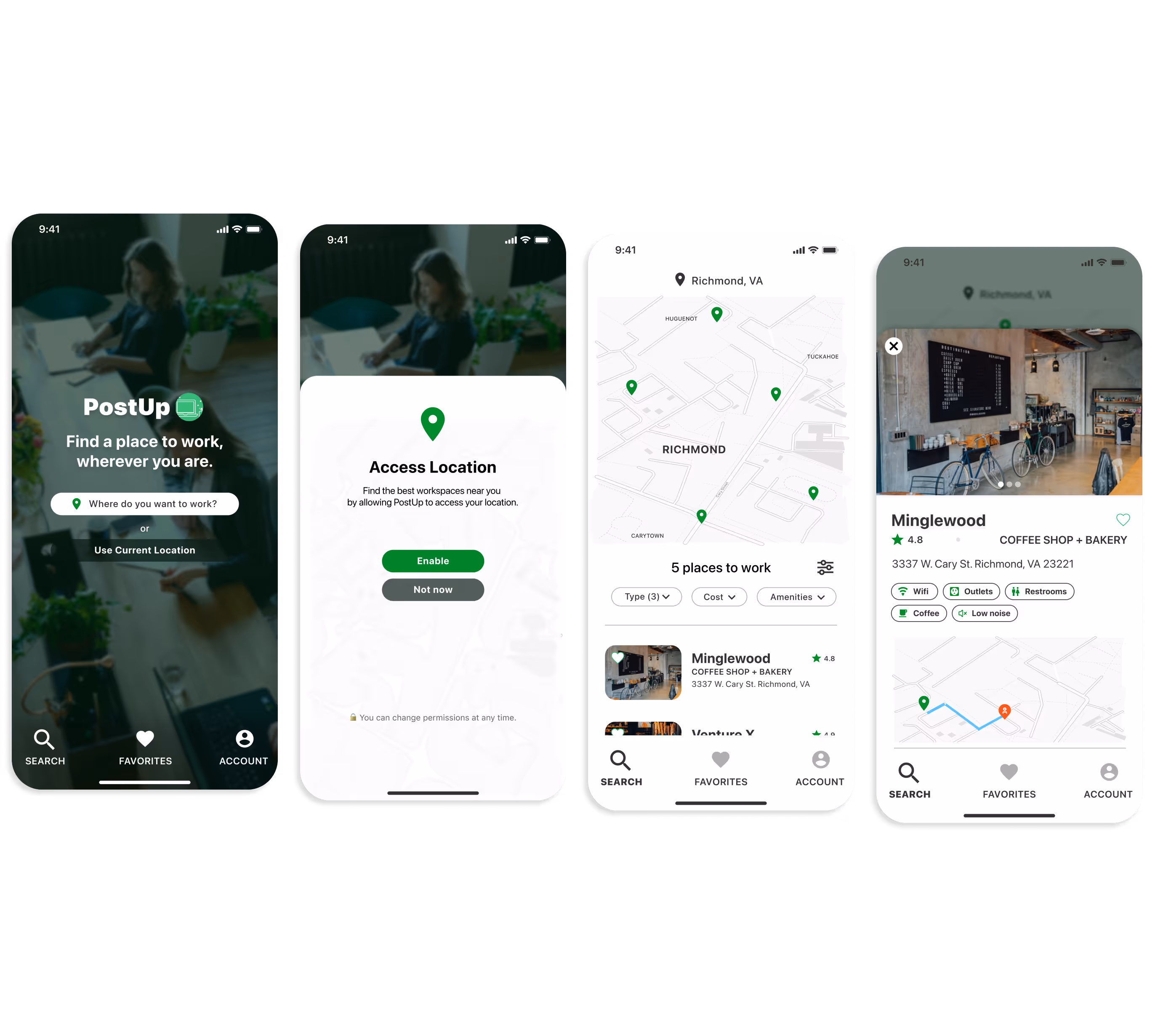
I visualized each step in the process of completing the most critical task: efficiently and easily finding a space to conduct remote work.
Recruiting test participants
Looking ahead to the last day of the sprint, I made it my goal to recruit five participants by the end of day one to take part in a brief usability test to validate my solution design.
This way, I could feel secure knowing I wouldn't need to scramble to find users to test the solution on the day-of. It also meant I would get genuine, immediate user feedback to evaluate the solution and bring that back to PostUp.
Through email outreach to a pool of contacts that met my criteria and a brief screener survey, I successfully scheduled 5 usability tests to be conducted on the final day of this sprint.